Form Designer Layout
Form Designer Panels
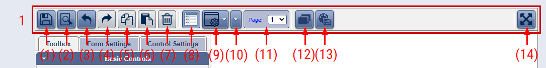
1. Main Toolbar - it contains buttons and dropdown menus for general actions, theme management, global settings, and control actions and settings.
In form mode (no selected controls) the toolbar contains following buttons and dropdown menus:
- (1) Save (Ctrl + S) - saves the form on the server
- (2) Preview - opens a dialog with a preview of the form
- (3) Undo (Ctrl + Z) - undoing the last change
- (4) Redo (Ctrl + Y) - redoing the last undoed change
- (5) Copy (Ctrl + C) - copies one or more controls
- (6) Paste (Ctrl + V) - pastes one or more controls
- (7) Delete (Del) - deletes one or more controls
- (8) Form helper area - this serves as helper area that you can click on and this will represent the same as a click on the form area.
- (9) Dropdown Menu - this menu gives you possibility to switch between buttons for form settings and control settings that are displayed on the toolbar. There should be at least one selected control to be able to switch the buttons.
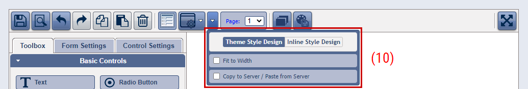
- (10) Dropdown Settings Menu - this menu gives you possibility to switch between Theme Style Design and Inline Style Design. It also allows to turn on the following options: a option that will fit the control to the width of the form; an option that if is on will copy the information to and will paste it from the server instead locally.
- (11) Themes - this opens the Themes dialog which allows you to select themes.
- (12) Custom Theme Manager - this allows you to save the current form theme as a User Custom Theme and reuse it later across multiple forms.
- (13) Maximize/Restore Down - maximize/restore down the Form Designer to/from full screen and vice versa.
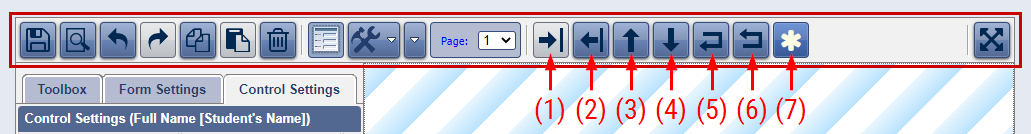
In selection mode (there are selected controls) the toolbar display following buttons for control actions and settings instead some of the described above:
- (1) Expand selected control(s) - expands the selected controls so that they fit to the whole form width. This can be applied via the Control Settings panel as well (General: Fit to width).
- (2) Shrink selected control(s) - shrinks the selected controls so that they fit to their inner elements. This can be applied via the Control Settings panel as well (General: Fit to width).
- (3) Move selected control(s) up - this action moves the selected control(s) with one position up in the list.
- (4) Move selected control(s) down - this action moves the selected control(s) with one position down in the list.
- (5) Move selected control(s) on a new line - this action will move the selected controls on a new line no matter if there is space for those on the previous line. This can be applied via the Control Settings panel as well (Control Inline Style: On a new line).
- (6) Merge the selected control(s) to above line - this action will move the selected controls to the above line if there is space there. This can be applied via the Control Settings panel as well (Control Inline Style: On a new line).
- (7) Require field completion - This action will turn on or off the requirement a field to be completed. This can be applied via the Control Settings panel as well (General: Required).
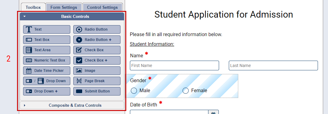
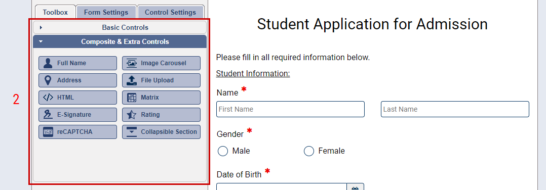
2. Toolbox - it contains built-in total of 24 basic, composite and extra controls and widgets that help you create multifunctional forms. The controls and widgets (hereinafter: controls) are separated in 2 collapsible section depending on their type. The first section contains basic controls. The second one contains composite and extra controls. All controls are draggable and clickable.
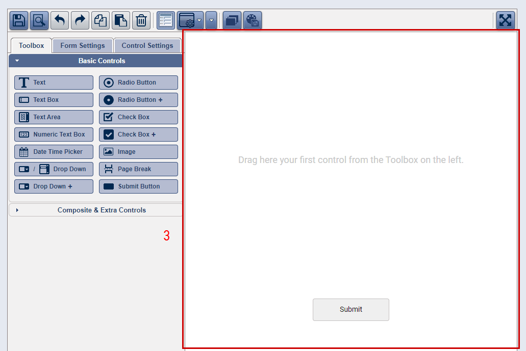
3. Form Area - this is the place where you create a form. It contains a "Submit Button" control initially when you create a blank form.
To add another control on the form area you need to drag and drop it from the toolbox (2) on the left. You can also click on the any control originator in the toolbox and
it will be added on the form area as each next control will be appended at the end of the list of controls just before the Submit button (the last one).
To select a control on the form area, please click on it. The Control setting (5) will be displayed.
To select multiple "Controls" use:
- hold "CTRL" and click mouse left button in order to select (or deselect) various consecutive (or inconsecutive) controls;
- hold "SHIFT" and click mouse left button in order to select various consecutive "Controls";
- hold "SHIFT" and key "A" and click mouse left button in order to select "Controls" from the same type (for example Text Box).
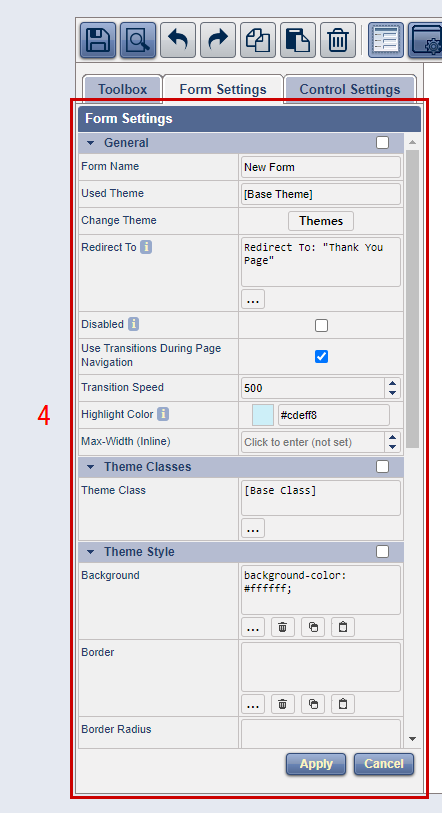
4. Form Settings - This panel contains settings allocated in 3 collapsible sections: General, Theme Classes and Theme/Inline Style.
General section contains settings for theme selection, options for redirecting when submitting the form, transition effects during the page navigation, highlight
color for the control that is on focus, etc.
Theme Classes section contains setting to apply a theme class to the form. You can create a new class, to delete a class, to change the class of the form, etc.
Theme Style/Inline Style - this section contains settings which allow you to apply various CSS properties to the form. As the form is only one, there is no difference
between Theme Style and Inline Style, except of that if you apply CSS settings to the form's class and you save the form's theme as a User Custom theme, yo will be able
to apply that theme on another form via the Theme Selection dialog and to change the form class if it's necessary.
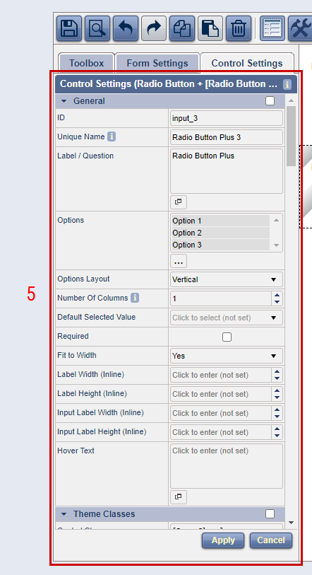
5. Control Settings - This panel contains settings allocated in various collapsible sections as following: General, Miscellaneous, Theme Classes, Control Theme/Inline Style,
Label Theme/Inline Style, Input Theme/Inline Style, Panel Theme/Inline Style, Setting Options, particular element's Theme/Inline Style.
The General section contains various most general settings as Unique name, Label/Question, Required, FitToWidth, Hover Text, size settings, etc.
The Miscellaneous section contains settings which are specific for particular controls.
The Theme Classes section contains settings to apply theme classes to the controls. You can create a new classes, to delete a classes, to change the classes of the controls, etc.
The Label Theme Style/Inline Style, Input Theme Style/Inline Style, Panel Theme Style/Inline Style, etc. - these sections contains settings which allow you to apply various CSS
properties to elements of the controls.
The Setting Options section contains a setting which allows you to select whose element's settings to be rendered in the section below.